Data Visualizations
Summary
For surveys launched on co:census, all of the features in the summary tab will update in real time as people complete your survey.
If you import data, these visualizations will populate once your import is complete. You’ll be notified when your import is complete via email.
Any visualizations that can be downloaded will have an “Export” button or have the following icon:

- Login to your co:census account. Upon login, you should see your home dashboard page.
- Select the project workspace you’re interested in exploring.
- On the Summary tab, scroll down to the heat map.
- Click on a section of the heat map. Each section represents a zip code.
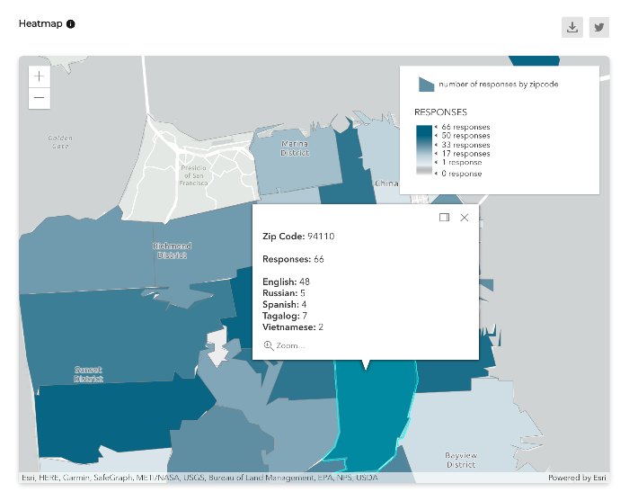
- After clicking on a zip code section, a card will appear and showcase the total number of responses and its language breakdown.
Insights
Our “Insights” tab hosts visualizations of your data that will help you understand what respondents are saying and synthesize the qualitative data you’ve collected, respectively.
Some of the features you’ll find in the visualizations tab include automated topic labeling, sentiment analysis, and a variety of filters that help you visualize your data in different ways.
Filtering your trends by category leverages our patent-pending NLP text classifier (titled the Dubois) and labels your data into one of the following categories: affect, behavior, condition, or solution.
This filtering mechanism is designed to help you better understand the context of your data.
The defining parameters of each category can be found below and on your project dashboard:
Affect - something that is done to someone
Behavior - something that is done by someone
Condition - something that is done to the environment
Solution - a possible answer to a problem